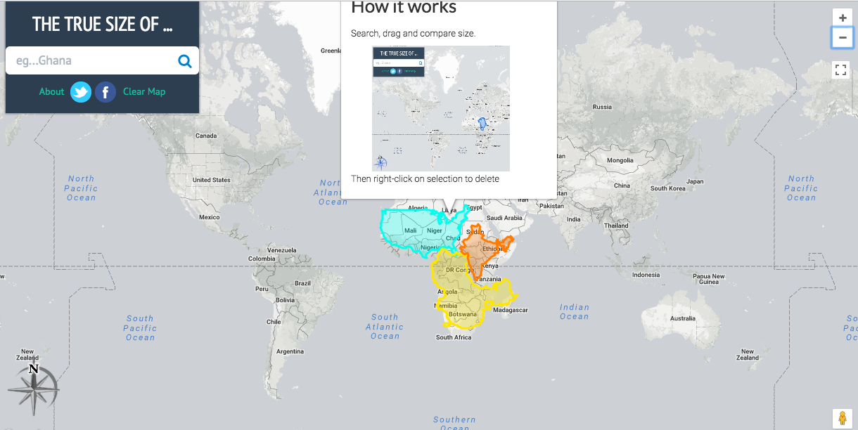
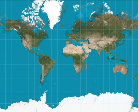
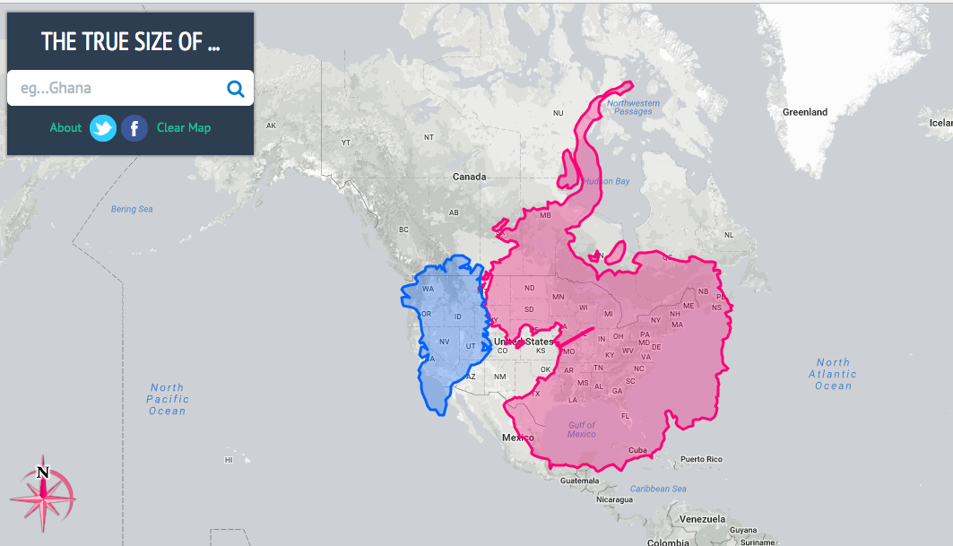
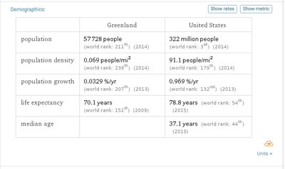
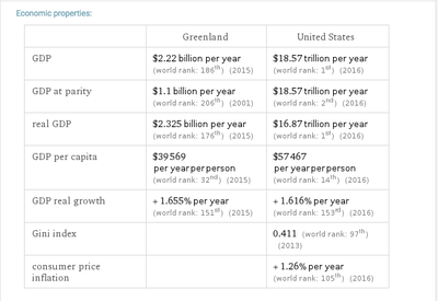
| True size is a cool website tool when you are working with maps. Many students do not understand how, lets say the Mercator projection map distorts the size of countries. True size helps us really see that. In the example below, we can compare how Greenland and Antarctica look on the Mercator map (right). They look huge... Antarctica is bigger then all the continents combined. However, when we use the True size (left), we can see how much smaller it really is when we overlay it on the United States. Give True Size a try an let me know your thoughts. |
|

 RSS Feed


